Slide #1

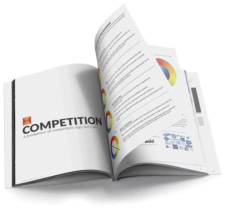
Brand Discovery & Logo Research for a Logistics Software Company

A strategic brand discovery engagement focused on logo design, emotional color theory, and competitive differentiation—building the foundation for a modernized

PROBLEM

Goals & Constraints

Exploring Identity Without a Defined Brief

I was engaged by a mid-sized logistics software company to conduct a top-level brand discovery initiative. There was no specific design brief, no explicit problem to solve—just a broad directive to “explore the brand.” The aim was to better understand how the company’s current logo and color system performed emotionally and competitively.

SOLUTION

Process & Thinking

Emotional Theory Meets Competitive Landscape

I approached the project by combining brand psychology, data-driven research, and visual mapping. The first step was understanding how color impacts brand trust and perception. I broke down primary emotions associated with specific hues and aligned those findings with the company’s brand personality. From there, I examined competitors’ logos and mapped their visual identity to a custom-built color wheel—giving the client a tangible snapshot of how they visually compare in their market.

Strategic Insights in Visual Identity

Mapping the Brand’s Visual Voice

Connecting Color, Emotion, and Market Differentiation

The heart of the project was in transforming abstract emotional data and competitor analysis into actionable insights. By comparing the client’s existing logo colors to industry trends, I provided clear, visual evidence of where they blend in—and where they have the opportunity to stand out. This gave them the foundation for a more intentional brand guide, informed by psychology and market data.

  • Emotional Color Grid

    Mapped color choices to emotional triggers like trust, creativity, and innovation.

  • Competitor Color Wheel

    Plotted where the brand’s color lives against key competitors—revealing overlap and white space.

  • Logo Variation Concepts

    Explored visual refinements with adjusted color palettes based on emotional resonance and contrast potential.

Results: Clarity, Positioning & a Path Forward

While the project didn’t result in a new logo rollout, it provided the client with something just as valuable: strategic clarity. The final deliverables included emotional color frameworks, a competitive analysis color wheel, and logo evolution options. They now have the tools to refine their visual identity and confidently guide future creative efforts.

0

Key competitors analyzed in-depth

0 +

Logo refinement options delivered

0

Actionable brand color profiles proposed

Ready to Build Something Brilliant?

If this kind of custom work is what your project deserves, let’s talk. I specialize in crafting smart, scalable solutions that make life easier—for you and your users.