How 3 Smart EHR UI Design Fixes Improved Home Health Workflows
Designing an Intuitive, Touch-Friendly Experience for Clinicians in the Field
Role
UX Designer & Front-End Strategist
Project Type
Clinical Interface Redesign
Tech Stack
Adobe XD, Bootstrap, internal CMS
PROBLEM
Goals & Constraints
Streamlining Clinical Interfaces for Real-World Users
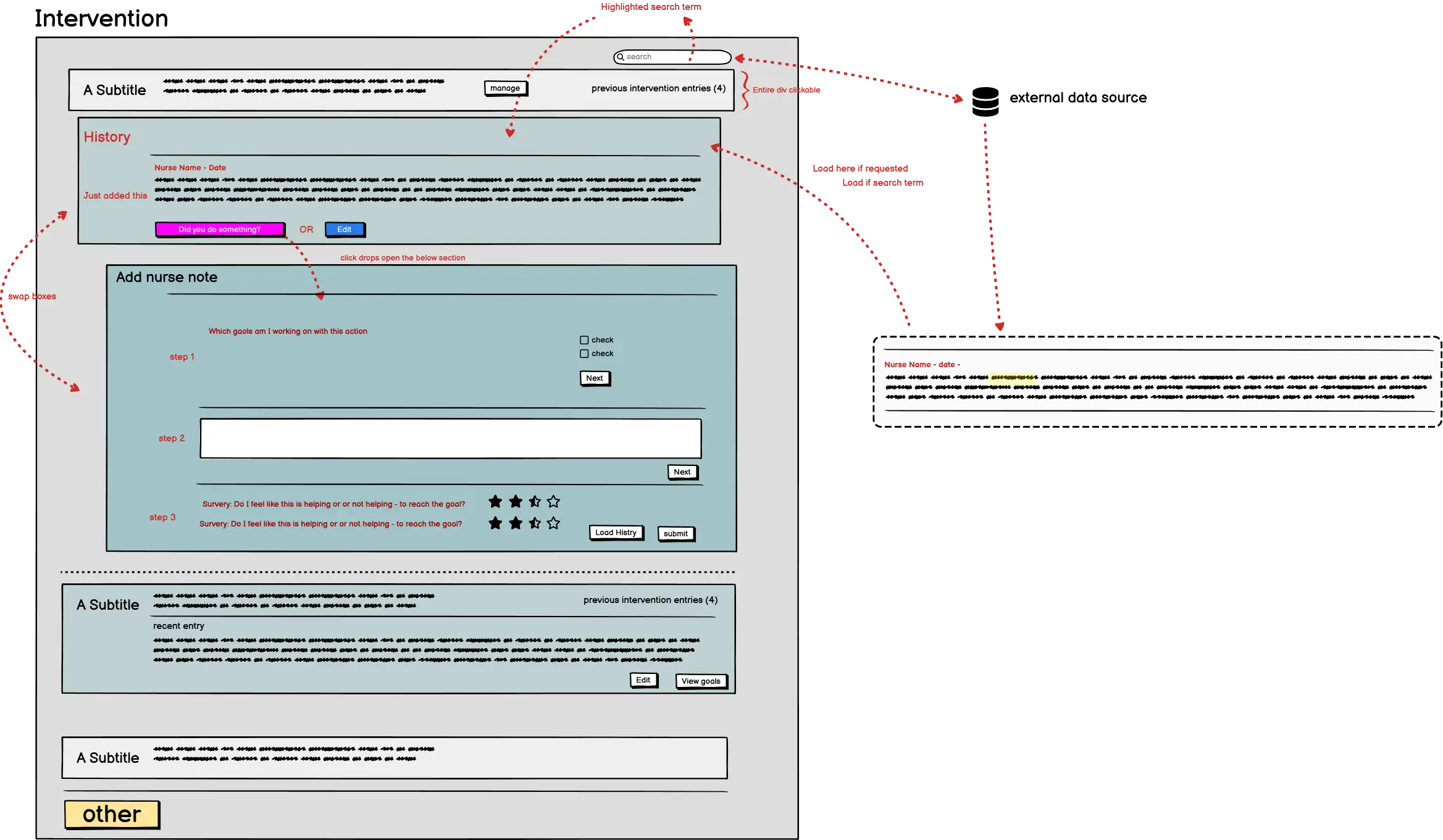
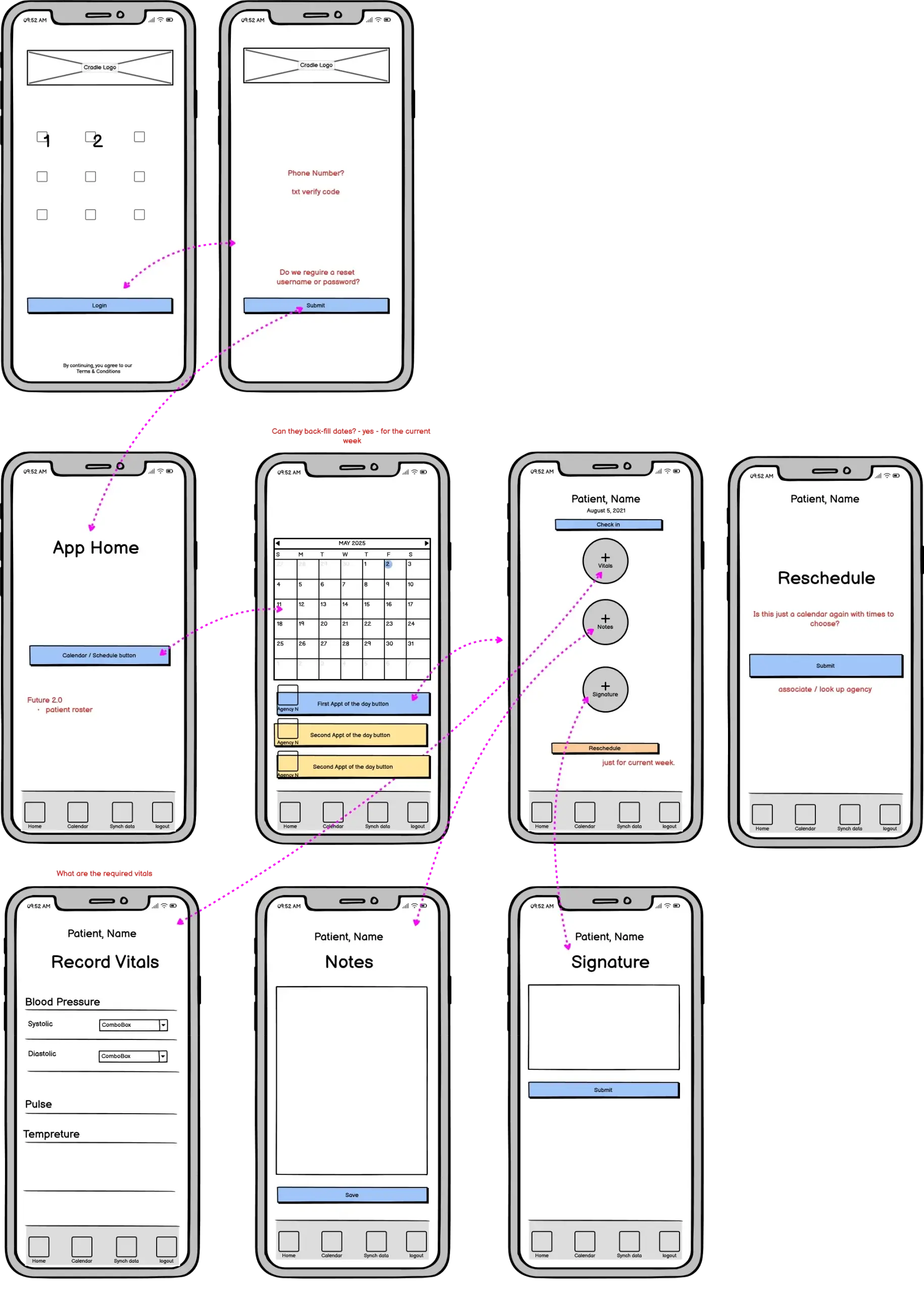
This project focused on refining the user experience of an electronic health record (EHR) interface used in home health care. Field clinicians needed a faster, more intuitive system to reduce errors and improve the speed of documentation during in-home visits. However, limitations like legacy code, compliance requirements, and device constraints created real design challenges.
System was built on a legacy platform with limited front-end flexibility
Interface updates had to comply with HIPAA and home care documentation standards
SOLUTION
Process & Thinking
Human-Centered UX for High-Stakes Environments
The redesign process began with direct observation of clinicians during home visits, followed by a heuristic audit of the existing EHR interface. Our approach prioritized clarity, predictability, and reducing friction at every interaction point. Prototypes were validated through usability testing before implementation in production.
Conducted contextual inquiry with real home health nurses to map pain points
Created wireframes and interactive prototypes using Figma
Prioritized changes that could integrate with the existing backend without disruption
Conducted contextual inquiry with real home health nurses to map pain points
Created wireframes and interactive prototypes using Figma
Prioritized changes that could integrate with the existing backend without disruption
Inside the Fixes: How UX Tweaks Transformed Productivity
The Engine Behind the Results
Behind every improved tap, swipe, and scroll was a UX decision rooted in real clinical needs—refined, tested, and implemented with precision.
Improving the experience required targeted, strategic changes that respected the complexity of healthcare UX design. These changes didn’t just polish the interface—they fundamentally restructured how clinicians interacted with their tools.
Visual Hierarchy Refresh
Clearer fonts, grouped data, and adjusted color usage reduced cognitive load and helped clinicians find what they needed faster.
Gesture-Optimized Interactions
Tap targets, form elements, and navigation were redesigned to align with thumb zones on tablets, preventing input errors.
Dynamic Progress Tracking
A subtle visual indicator tracked visit documentation progress, helping clinicians complete tasks more efficiently without needing to scroll or backtrack.
Results: Efficiency, Clarity, and Happier Clinicians
The redesign led to measurable improvements in usability testing, faster documentation in the field, and stronger compliance with visit requirements—all without requiring backend redevelopment.
0sec
average seconds saved per visit note section
0
interface errors caught per user dropped to 1
0%
increase in satisfaction score during testing
Ready to Build Something Brilliant?
If this kind of custom work is what your project deserves, let’s talk. I specialize in crafting smart, scalable solutions that make life easier—for you and your users.